Media feature of CSS helps us render a piece of information (specifically speaking “layout”) differently according to the media types. This is one of the important features of CSS. It is very crucial at this point of time when each day you are introduced to a new media type. So, it is a good idea to specify different layouts for different media like mobile phone, tablet, and print media.
The layout for all the media types cannot be the same. So, the design depends on the device (or medium)
There are two ways of doing this. One is to use @media and the other @import.
This chapter focuses on the widely used @media rule.
The same style sheet can have the style information for all the different types of devices.
General Syntax
@media target_medium{
/* style rules for target medium */
}
The target medium may be only one medium or different types of media separated by commas. Like this:
@media target_medium1,target_medium2{
/* style rules for target medium */
}
Using @media increases the responsiveness of the design across different sizes of viewport from small to large or anywhere in between
The target media or Types of media
Media Type | Description |
all | Suits all devices |
braille | Used on Braille tactile feedback devices |
Embossed | This type is for paged Braille printers |
handheld | Intended for small handheld devices. Small Viewport. |
This type is intended for printed material and for documents that are previewed in print mode | |
speech | used for speech synthesizers. It is also called “aural” in CSS2 |
Projection | used for presentations on projectors like styling for slides |
screen | Used for color screens |
tv | used for television like low resolution devices |
tty | used for devices with limited display capabilities like portable devices |
Note: Media types are case-insensitive, “print” is same as “PRINT”
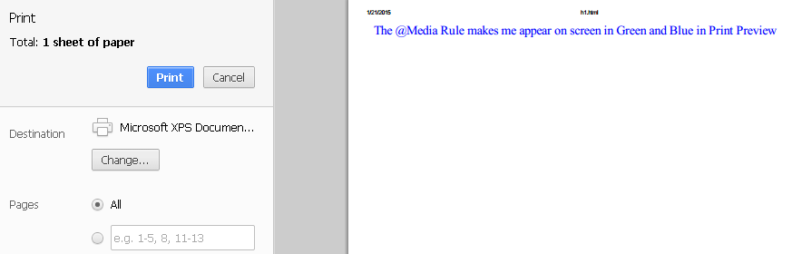
An Example:
<html>
   <head>
      <style>
         @media print{
         body{font-size:16pt; color: Blue;}
         }
         @media screen{
         body{font-size:12pt; color: Green;}
         }
      </style>
   </head>
   <body>
      The @Media Rule makes me appear on screen in Green and Blue in Print Preview
   </body>
</html>
Output in Normal Mode

Output in Print preview mode