
User interface is the part of an app that user directly access and interact with it. So, while developing any project developer needs to ensure that it has very attractive and efficient user interface.
I window store apps there are so many feature are available for creating a very attractive user interface. Like UI elements, flyouts, styles and animations etc.
Adding UI elements to an Interface
To design the Interface of an app we need to add various UI(User Interface) elements to the app. In windows store app adding UI elements to an interface there are two ways available:
At the design time
At the designing time we can add UI elements using XAML code. This we can accomplish using two ways:
By writing the XAML code for the control in text editor.
By dragging the controls from toolbox onto the design surface using IDE.
At the run time
At the run time we can add UI elements using C# along with XAML code.
Controls in Windows store app
Text Controls:
These controls are used to accept text from user or If we want to display some text in form of Lables to user. Text controls are further classified in following types.
TextBox:
This control is used to accept data from user in the form of single line or multiline text input.
<TextBox><TextBox/> tag is used in XAML code. We can also customize the textbox and style of thex by using various properties of TextBox control.
|
|
| Used to set or retrieve the contents of textbox as string |
| Used to set or retrieve the height of textbox. |
| Used to set or retrieve the width of textbox. |
| Used to set the color of content of textbox. |
| Used to set the breaking of line of text. Possible values are Wrap/NoWrap. By default is Wrap |
| Used to get or set a value that determines whether the textbox move to the next line by pressing Enter key or not. Possible values are True/False.By default is False. |
| Used to enable or disable the spell check feature in TextBox.Possible values are True/False. By default is False. |
| Used to enable or disable the editing of the TextBox. Possible values are True/False. By default is False. |
To add a multiline text box in window store app, we need to set theTextWrapping property as Wrap and the AcceptReturn property as True.
TextBlock:
This control is used to display non editable text or label element in our app. Use <TextBlock> tag in XAML to add TextBlock control.
|
|
| Used to set or retrieve the contents of text block |
| Used to set the visibility of text block. Possible values are Visible/Collapsed. By default the value is Visible. |
| Used to set the font family of contents. |
| Used to set the font size in pixels. |
| Used to set the color of content. |
| Used to set the horizontal alignment of text block. |
| Used to set the outer margin of the text block from left, top, right and bottom. |
| Used to set the vertical alignment of the text block. |
| Used to assign a unique name to the text block. |
PasswordBox
|
|
| Used to set or retrieve the characters in place of original text. |
| Used to set or retrieve the maximum number of characters that can enter in box. |
| Used to set or get string as password. |
| Used to enable or disable the visibility of the reveal button in the password box. |
Buttons
| Property | Description |
| IsEnabled | Used to get or set a value that decides the user can interact with the button or not. |
| Background | Used to get or set background color for the button |
| FontSize | Used to set the size of text. |
| Height | Used to set or get the height of button |
| Style | Used to get or set an inbuilt or custom style for the button |
| Content | Used to get or set the text that will appear on button |
App Bars
This is the new feature of Windows 8. It supports content before chrome feature. By default it is hidden and displayed whenever required. It can be add in application by using AppBar control.
| Property | Description |
| VerticalAlignment | Used to set the vertical alignment of the app bar. Possible values are Bottom, Center, Stretch and Top |
| HorizontalAlignment | Used to specify the horizontal alignment of the app bar. |
| IsOpen | Used to set or get a value that indicates whether the app bar is visible. |
Images and Shapes
To display images in app, Image control can be used. The source image should be kept in root folder or in Assets folder of the project.
| Property | Description |
| Source | Used to get or set the location of image source file. |
| Height | Used to get or set the height of the image. |
| Width | Used to get or set the width of the image. |
| Opacity | Used to get or set the degree of visibility of the image. |
Shape
To draw shapes in app. We can use <Rectangle></Rectangle> or <Ellipse></Ellipse> control in app.
| Property | Description |
| Fill | Used to get or set color or gradient foe the interior of the shape |
| Height | Used to get or set the height of shape |
| Width | Used to get or set the width of shape |
| Margin | Used to set or get the outer margin of the shape. |
Collection/Data Controls:
These controls are used to display a set of data items in an app. These are of following types:
Flip view:
This control displays one item at a time and user can flip between the items of collection. <FlipView> control can be used for this.
| Property | Description |
| HorizontalAlignment | Used to get or set the horizontal alignment of the flip view. Possible values are Left, Center, Right or Stretch. |
| VerticalAlignment | Used to get or set the vertical alignment of the flip view. Possible values are Top, Center, Bottom or Stretch. |
Grid view
This control is used to add a collection of items in the form of grid. <Grid> control is used in XAML to add this control.
| Property | Description |
| Margin | Used to get or set the outer margin of the grid. |
| SelectionMode | Used to get or set the way items can be selected in the grid view. Possible values are Extended, Multiple, None and Single. |
| VerticalAlignment | Used to get or set the vertical alignment of grid control |
List view
This control is used to add a list of items in app that can be scrolled vertically.
| Property | Description |
| Margin | Used to get or set the outer margin of the list view. |
| SelectionMode | Used to get or set the way items can be selected in the list view. A user can select one or more items by setting the value of SelectionMode property. Possible values are Single, Multiple or Extended. |
Semantic zoom
This control is used to zoom between two views of the same content. For this Semantic Zoom control uses two controls, one that provides the zoomed in view and the other provides zoomed out view. Firstly we use <SemanticZoom> </SemanticZoom> control, then we add <SemanticZoom.ZoomedInView /> and <SemanticZoom.ZoomedOutView /> controls.
| Property | Description |
| ZoomedOutView | Used to get or set the zoomed out view of this control |
| ZoomedInView | Used to get or set the zoomed in view of this control. |
| IsZoomedInViewActive | Used to get or set a value that decides whether the zoomed in view is active view. |
| IsZoomOutButtonEnabled | Used to get or set a value that decides whether a button is present in zoomed in view that switches user to zoomed out view. |
Selection Controls
These controls provide the way of selection controls in which user select multiple options.
Radio button
This control allows user to create a set of options from which user can choose only one option.
| Property | Description |
| Content | Used to get or set the text displayed with radio button. |
| IsChecked | Used to determine whether the radio button is selected. |
| GroupName | Used to get or set the name of group of radio button. |
Check box
User can choose multiple options from a group of options.
| Property | Description |
| Content | Used to get or set the text displayed along with check box. |
| IsChecked | Used to determine whether the checkbox is selected or not. |
| Combo box | |
| Property | Description |
List box
This control is used to display a list of items from which a user can select one or more items.
| Property | Description |
| SelectionMode | Used to get or set whether a single option or multiple options can be selected. Possible values are Single, Multiple or extended. |
| SelectedIndex | Used to get or set the index of the selected item |
| SelectedItems | Used to get the list of selected items. |
Slider
This control is used to select a value from a continuous range of values. User can select a value by pointing along a track.
| Property | Description |
| Value | Used to get or set the current value on the slider |
| Maximum | Used to get or set the maximum value present on slider range. By default the value is 100 |
| Orientation | Used to get or set the orientation of slider control. Possible values are horizontal and vertical. By default it is horizontal. |
Toggle button
This control represents a button that can be switched between two states.
| Property | Description |
| Content | Used to get or set the caption of toggle button |
| IsChecked | Used to get or set a value that decides whether the toggle button is selected or not. |
Toggle switch
This control represents a switch button that can be toggled between two stages.
| Property | Description |
| Header | Used to get or set the title of toggle switch |
| IsOn | Used to get or set the value that decides whether the toggle switch is on or off. |
| OnContent | Used to get or set the text to be displayed on On state |
| OffContent | Used to get or set the text to be displayed on Off state |
Media Controls
These controls are used to include audio and video in app
| Property | Description |
| Source | Used to get or set the path of the media |
| Volume | Used to get or set the volume of the media |
| Position | Used to get or set the position upto which media has been played. |
| AutoPlay | Used to get or set whether the media will be start auto playing. |
| NaturalDuration | Used to get or set the duration or length of the currently opened media file. |
| IsLooping | Used to get or set the property by which media will be played in a loop. |
| PosterSource | Used to get or set the source of an image that can be displayed when media is loading or playing. |
Navigation Controls
These controls are used to navigate from one page to another page or window of an app.
HyperLink Button
This control is used to add a hyperlink to app. Using this link a user can navigate to another location, it can be a file or web location.
| Property | Description |
| Content | Used to get or set the text that appear on the hyperlink. |
| NavigateUri | Used to get or set the Unique Resource Identifier of file location. |
Progress Controls
These controls are used to represent the progress of an operation that takes more than 2 seconds to complete.
ProgressBar
It indicates the progress of an operation by displaying a bar. It can be determinate or indeterminate progress. The determinate progress shows percentage of the completion of an operation, Indeterminate shows only that the operation is in progress.
| Property | Description |
| IsIndeterminate | Used to get or set a value specifies whether the progress bar is determinate or Indeterminate |
| Maximum | Used to get or set the highest possible value of progress. |
| Value | Used to get or set the current value of progress |
ProgressRing
This control is used to indicate the indeterminate progress by displaying a ring.
| Property | Description |
| IsActive | Used to get or set a value that specifies whether the progress ring is functioned or not. |
| Foreground | Used to get or set a solid color or gradient for the progress ring. |
Demonstration
We have to create Music Player App , which should has following Interface:

For this we can use various UI elements of XAML like:
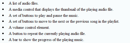
After the completion of adding elements in User Interface, following Interface will be created:

For this we have to use following steps:
- Create a blank Windows store app.
- Design the playlist
- Add media control
- Add player button
- Add volume control
- Add slider
- Verify the app
For this we have to create XAML application like this:
MusicPlayer.xaml file
<Page x:Class="MusicPlayer.MainPage" xmlns="http://schemas.microsoft.com/winfx/2006/xaml/presentation" xmlns:x="http://schemas.microsoft.com/winfx/2006/xaml" xmlns:local="using:MusicPlayer" xmlns:d="http://schemas.microsoft.com/expression/blend/2008" xmlns:mc="http://schemas.openxmlformats.org/markup-compatibility/2006" mc:Ignorable="d"> <Grid HorizontalAlignment="Center" VerticalAlignment="Center"> <Viewbox> <Grid x:Name="grdMusicPlayer" Background="Black"> <Button Content="PlayList" HorizontalAlignment="Left" Margin="7,55,0,0" VerticalAlignment="Top" Background="CadetBlue" Width="360" Height="53" FontSize="24" BorderThickness="0"/> <ListBox FontSize="22" x:Name="lstViewPlayList" HorizontalAlignment="Left" Height="642" Margin="10,105,0,0" VerticalAlignment="Top" Width="355" BorderBrush="Blue" BorderThickness="1" ScrollViewer.VerticalScrollBarVisibility="Auto" ScrollViewer.HorizontalScrollBarVisibility="Auto"/> <Grid HorizontalAlignment="Left" Height="454" Margin="391,58,0,0" VerticalAlignment="top" Width="948"> <Border BorderBrush="White" BorderThickness="3"> <MediaElement x:Name="mediaSource" AutoPlay="False" Height="Auto" Width="Auto" Margin="0,4,0,-4"/> </Border> </Grid> <Button x:Name="bttnPlay" Margin="807,662,0,21" Visibility="Visible" Content="" FontFamily="Seoge UI Symbol"> </Button> <Button x:Name="bttnPause" Visibility="Collapsed" Margin="807,662,0,21" Content="" FontFamily="Seoge UI Symbol"> </Button> <Button x:Name="bttnPrevious" Margin="696,662,0,21" Content="" FontFamily="Seoge UI Symbol"> </Button> <Button x:Name="bttnNext" Margin="971,662,0,21" Content="" FontFamily="Seoge UI Symbol"> </Button> <ToggleSwitch x:Name="tglSwitchMediaRepeat" Header="" HorizontalAlignment="Left" Margin="392,678,0,0" VerticalAlignment="Top" OffContent="Repeat Off" OnContent="Repeat On"/> <TextBlock x:Name="tglBttnVolume" Margin="1155,681,0,0" HorizontalAlignment="Left" VerticalAlignment="Top" FontFamily="Webdings" FontSize="34" Text="U" Height="39"/> <Slider x:Name="sldrVolume" HorizontalAlignment="Left" Margin="1203,678,0,0" VerticalAlignment="Top" Width="135" Height="44" LargeChange="10" Maximum="100" StepFrequency="1" SmallChange="5" Background="#FF4486E6"> </Slider> <Slider x:Name="prgsBarSongPosition" HorizontalAlignment="Left" Height="51" Margin="391,599,0,0" VerticalAlignment="Top" Width="948" Background="#FF4486E6" IsThumbToolTipEnabled="False"/> </Grid> </Viewbox> </Grid> </Page>
MusicPlayer.xaml.cs file
using System;
using System.Collections.Generic;
using System.IO;
using System.Linq;
using Windows.Foundation;
using Windows.Foundation.Collections;
using Windows.UI.Xaml;
using Windows.UI.Xaml.Controls;
using Windows.UI.Xaml.Controls.Primitives;
using Windows.UI.Xaml.Data;
using Windows.UI.Xaml.Input;
using Windows.UI.Xaml.Media;
using Windows.UI.Xaml.Navigation;

// The Blank Page item template is documented at http://go.microsoft.com/fwlink/?LinkId=234238
namespace MusicPlayer
{
    /// <summary>
    /// An empty page that can be used on its own or navigated to within a Frame.
    /// </summary>
    public sealed partial class MainPage : Page
    {
TextBlock txtPlayStatus = new TextBlock();
        public MainPage()
        {
            this.InitializeComponent();
            txtPlayStatus.Name = "txtPlayStatus";
            txtPlayStatus.Margin = new Thickness(390, 535, 25, 198);
            txtPlayStatus.FontSize = 18;
            txtPlayStatus.TextAlignment = TextAlignment.Center;
            grdMusicPlayer.Children.Add(txtPlayStatus);
        }
        /// <summary>
        /// Invoked when this page is about to be displayed in a Frame.
        /// </summary>
        /// <param name="e">Event data that describes how this page was reached.  The Parameter
        /// property is typically used to configure the page.</param>
        protected override void OnNavigatedTo(NavigationEventArgs e)
        {
        }
    }
}