
Introduction
We have developed a number of mobile apps in the previous tutorials. By now, you might have realized that the apps we have developed look more like web applications, not like traditional mobile apps. In other words, as PhoneGap uses HTML, CSS and JavaScript, the user interface we create do not have that professional look of normal mobile apps. Instead, the screens look more like web applications. There is a very popular library called jQuery Mobile that allows us to design responsive and professional cross-platform apps.
Include jQuery Mobile in Your Apps
jQuery Mobile being a JavaScript library, we should include it in our index.html file before designing jQuery Mobile apps. There are two options to include it: either online or offline. If your internet connection is not that stable, you can download jQuery Mobile library and add a link to it in the index.html file. To do this, go to the site at http://jquerymobile.com/download-builder/ and select the parts of the libraries you want. Then, click the Build My Download button which will download a zipped file into your computer. Unzip the file and add the link to the .js and .css files in your index.html file.
The second option is accessing the library online. Copy the snippet for jQuery CDN hosted files given at http://jquerymobile.com/download/ and paste it in the <head> section of the index.html file. We are going to follow this method.
Create an App
Let us create an app that accepts some inputs from the user. As the objective of this tutorial is just looking into the look and feel of the app, we are not doing any jQuery coding here. We will just add a number of input elements using jQuery Mobile library to make our screen more congruent with mobile apps.
Create an iOS application named iOSProfessionalApp. Once the project is created on the desktop, open the folder and double click the iOSProfessionalApp.xcodeproj icon to launch the project. Now the project is opened in the XCode environment. Again go back to the project folder on the desktop, open the index.html file inside the www folder using your favourite text editor and clean it up.
As we are planning to include jQuery Mobile library online, add the following lines of code inside the <head> section of the index.html file.
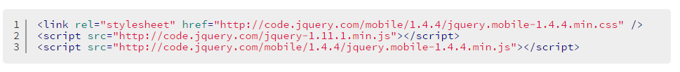
<link rel="stylesheet" href="http://code.jquery.com/mobile/1.4.4/jquery.mobile-1.4.4.min.css" />
<script src="http://code.jquery.com/jquery-1.11.1.min.js"></script>
<script src="http://code.jquery.com/mobile/1.4.4/jquery.mobile-1.4.4.min.js"></script>
In jQuery Mobile, we add a data-role attribute to control the behaviour of the element. For example, if you want to make a hyperlink (<a>) appear as a button, then you can add an attribute data-role to the hyperlink and then set its value to button. As we proceed, we will set different values to the data-role attribute based on how we want that particular element to llok like.
Add the following lines of code inside the <body> section.
<form action="#" method="post">
<div class="ui-field-contain">
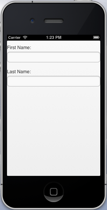
<label for="fName">First Name:</label>
<input type="text" id="fName" /><br />
<label for="lName">Last Name:</label>
<input type="text" id="lName" /><br />
</div>
<form>
Here I have not added reference to any other page in the action attribute of the form element as we are concentrating only on the look of the screens. You might have noticed that the class attribute of the <div> element has value ui-field-contain. This is used to wrap a label and its corresponding input element. For example, here we have grouped the labels and their corresponding input elements using the <label> element and setting the value of the for attribute to the id of the corresponding input element. To make it clear, the id of the textbox is fName and we have set the value of the for attribute of the <label> element the same, that is fName. This way, we are grouping the label First Name: and the textbox that accepts the first name.
In the previous versions of jQuery Mobile, instead of setting the value of class attribute to ui-field-contain, we have been setting the value of data-role itself to field-contain to wrap a label and its corresponding input element. The data-role="field-contain" has been deprecated in version 1.4 and will be removed in version 1.5.
After saving the index.html file, if you run the project in XCode environment, we will get a screen like this:
Next let us add two radio buttons to select the gender of the user. Add the following lines of code:
<fieldset data-role="controlgroup" data-type="vertical">
      Gender:

      <input type="radio" name="gender" id="male" checked="checked">
      <label for="male">Male</label>
      <input type="radio" name="gender" id="female">
      <label for="female">Female</label>
</fieldset><br />
Here we have set the value of data-role to controlgroup to group the radio buttons removing all margins between them. We have set the value of data-type to vertical to display them one below the other. You can set its value to horizontal if you want the buttons appear side by side. Now your screen will look like this:
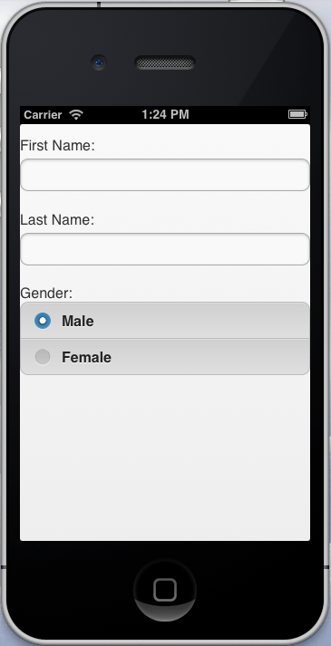
Here, the first radio button is checked by default as we have set the value of its checked attribute to checked.
Next we are going to add check boxes. Add the following lines of code.
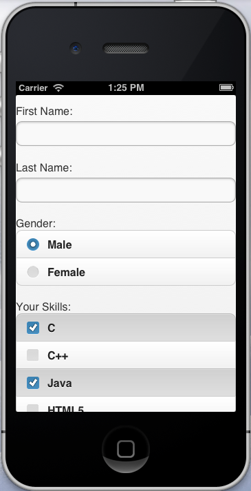
Your Skills:<br />
<div data-role="controlgroup">
       <label for="c">C</label>
       <input type="checkbox" name="skill" id="c" value="c">
       <label for="cpp">C++</label>
       <input type="checkbox" name="skill" id="cpp" value="cpp">
       <label for="java">Java</label>
       <input type="checkbox" name="skill" id="java" value="java">
       <label for="html5">HTML5</label>
       <input type="checkbox" name="skill" id="html5" value="html5">
       <label for="css3">CSS3</label>
       <input type="checkbox" name="skill" id="css3" value="css3">
</div><br />
After checking some of the skills, your screen will look like this:
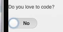
Let us add a toggle switch which is actually not supported by HTML only. Add the following lines of code.
<label for="code">Do you love to code?</label><br />
<select name="code" id="code" data-role="slider">
     <option value="no">No</option>
     <option value="yes">Yes</option>
</select><br />
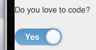
By setting the value of data-role to slider, jQuery displays the element like a slider. You might have used this kind of binary flip switch that accepts true or false answers. You can just drag the flip handle or even tap on one side to change the input. Now your flip switch will look like this:
If you change the output, it will look like this:
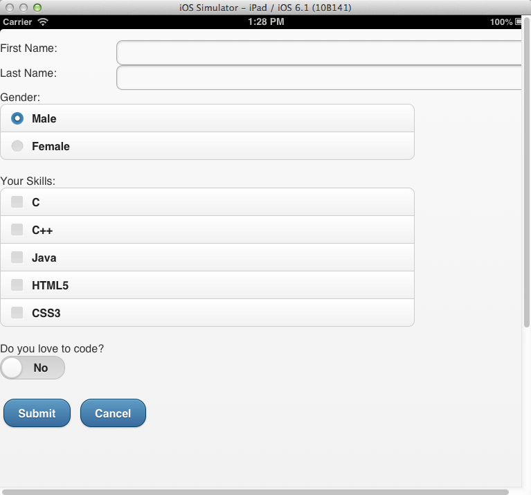
Next let us add two buttons to submit and cancel the inputs. Add the following lines of code:
<button id="btnSubmit" data-role="button" data-inline="true" data-theme="b">Submit</button>
<button id="btnCancel" data-role="button" data-inline="true" data-theme="b">Cancel</button>
Here, we have set the value of data-inline to true. If we do not set the value of data-inline, the button will fill the width of the complete screen. As we do not want to have the button that long, we set the value of data-inline to true. We have also set the value of data-theme to b. In fact, jQuery Mobile offers a couple of different themes. The theme decides the colour, corner radius, font family etc of the button. By setting the value of data-theme to b, the button becomes blue in colour. Other available data-theme values for buttons are a, c, d and e. You can try these values and see the difference in the appearance.
To see the entire screen clearly, you can select and iPad simulator and run the project. Now your screen will look like this:
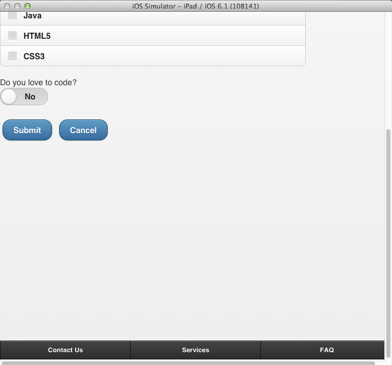
In real mobile apps, you might have seen tool bar at the bottom of the screen that provides buttons or links. Let us also try to add a footer like that. Add the following lines of code:
<div data-role="footer" data-theme='a' data-position="fixed">
     <div data-role="navbar">
             <ul>
                  <li><a href="#">Contact Us</a></li>
                   <li><a href="#">Services</a></li>
                   <li><a href="#">FAQ</a></li>
              </ul>
      </div>
</div>
We have set the value of data-role to footer. We have also set the value of data-theme to a in order to change the look of the footer and also set the value of data-position to fixed. If we do not set the value of data-position, it will appear just below the existing elements. When we set the value of data-position to fixed, the footer will be displayed at the bottom of the screen. We have also added a navigation bar by setting the data-role to navbar. We have added an unordered list with a number of links as well. Now the screen will look like this:
Like this you can also headers to the screen.
Summary
In this tutorial, we have created an app that accepts inputs from the user. We have added only a couple of elements to create more mobile-like screens. In fact, you can do wonders using jQuery Mobile and create really professional looking apps.