
As an app developer, we need to ensure that app should be attractive, fast and fluid. It can be implemented in a window store app using styles and animations. A developer should also ensure that maximum screen space should be provided to contents and less frequently commands should appear only whenever they required.
Applying Styles to Controls
Predefined Styles
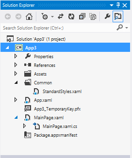
Styles can be used to enhance the appearance of the controls. For this we can use various properties of controls. Styles maintain a consistent look of controls in an app. At the time of creation of an app styles are available in predefined manner in StandardStyles.xaml file which is present in common folder.
StandardStyles.xaml file is a resource dictionary file that defines various style resources of an app, this resource dictionary file can be used in an app or can be shared among apps using <ResourceDictionary Source=”common/StandardStyles.xaml” /> tag.
Style can be applied by defining the style attribute of the control using StaticResource extension.
For eg if we apply a button control in our app, it will look like:

Rectangular Button
But if we apply AppBarButtonStyle style to this button, it will look like:

AppBarButtonStyle Button
In window Store Apps same style cannot be applied on all controls. Styles are control specific.
Custom Styles
Custom styles are user defined styles that can be defined as an inline style using XAML code or as a resource file. Inline styles can be applied on only one control in which it is defined; on the other hand resource style can be applied on multiple controls of the same type.
Inline styles
In Inline styles the attributes of the element are defined between the opening and closing tag of the element. Inline styles can be defined in following ways:
- By adding opening and closing tags for each attributes that we have to set.
- By using shortcuts for the styles within the tag of the controls.
For eg.
If we want to apply style to a TextBox, where background color is black and foreground color is white, we can use following xaml code:
<TextBox>
    <TextBox.Style>
        <Style TargetType=”TextBox”>
            <Setter property=”Background” Value=”Black”></Setter>
            <Setter property=”Foreground” Value=”White”></Setter>
        </Style>
    </TextBox.Style>
</TextBox>
Style as a Resource
Custom style that are created as a resource can be defined in following ways:
- In the XAML file of an individual page
- In a resource dictionary file
- In the App.xaml file
When a style is to be defined for an individual page the <Style> </Style> tags are written within the <Page.Resources> </Page.Resources> tags. While defining style in the resource dictionary file or in the App.xaml file, the <Style> </Style> tags are written within the <ResourceDictionary> </ResourceDictionary> tags.
XAML code to define style for an individual page:
<Page.Resouces>
    <Style TargetType=”TextBox”>
      <Setter property=”Background” Value=”Black”> </Setter>
      <Setter property=”Foreground” Value=”White”> </Setter>
    </Style>
</Page.Resources>
XAML code to define style in Resource dictionary file:
<ResourceDictionary>
   <Style TargetType=”TextBox”>
     <Setter property=”Background” Value=”Black”> </Setter>
     <Setter property=”Foreground” Value=”White”> </Setter>
   </Style>
<ResourceDictionary>
Explicit and Implicit Styles:
Implicit styles are globally applied to all controls of the specified target type. To make a style implicit, It should be ensure that style does not have x:key attribute, this attribute is used to specify a unique name to style. Implicit styles are used when there is need of consistent look and feel of the controls across a page.
Styles having x:key attribute are known as Explicit styles, these are not globally applied to all controls of the specified target. These are applied to controls that refer to the styles with the help of Style attribute. Explicit styles are used when we want only a set of controls to have that style.
<Page.Resources>
 <Style TargetType="Button" x:Key="numericButtonStyle">
    <Setter Property="Background" Value="Blue"></Setter>
    <Setter Property="Foreground" Value="White"></Setter>
    <Setter Property="Width" Value="100"></Setter>
    <Setter Property="Height" Value="100"></Setter>
    <Setter Property="FontSize" Value="50"></Setter>
 </Style>
</Page.Resources>
In this code explicit style is defined for the Button control. If we want to apply this style on a Button, we can use following code:
<Button Content="1" Style="{StaticResource numericButtonStyle}" > </Button>
Extending styles
Extending styles allow us to reuse the existing styles. Using this feature we can inherit all the settings of the base style and also we can add new settings or override the inherited settings of the base style. To extend a style we need StaticResource markup extension.
For eg.
<Style x:Key="sButtons" TargetType="Button" BasedOn="{StaticResource bButtons}">
 <Setter Property="Width" Value="123"></Setter>
</Style>
Flyouts
While developing window store apps, sometimes its require that some confirmation or information is to be provided to user and also need some user interaction by showing some controls on interface dynamically, It is also kept in mind that after taking input from user, these controls should be disappear from interface. These entire requirements can be accomplished using flyouts. In window store apps, following types of flyouts are commonly used:
Popup menu
PopupMenu control is small menu, which allows the users to frequently access commonly used controls for the text or other UI elements in an app. It displays when user right clicks or right tap on screen. Like cut, copy and Paste option.
Popup menu can be added at Runtime using C# code or at design time using XAML code.
Following code shows a popup menu at RightTapped event
Windows.UI.Popups.PopupMenu pmenu=new Windows.UI.Popups.PopupMenu();
UICommand redColorCommand=new UICommand();
redColorCommand.Label=”Red”;
redColorCommand.ID=1;
pmenu.Commands.Add(redColorCommand);
UICommand greenColorCommand=new UICommand();
greenColorCommand.Label=”Green”;
greenColorCommand.ID=2;
pmenu.Commands.Add(greenColorCommand);
UICommand blueColorCommand=new UICommand();
blueColorCommand.Label=”Blue”;
blueColorCommand.ID=3;
pmenu.Commands.Add(blueColorCommand);
Tooltip
control allows to add a short description to another control. It is automatically appeared when the user moves mouse pointer over a control and disappears when mouse pointer moves away from the control. It can also be added at design time using XAML code and at Runtime using C# code.
Message dialog
MessageDialog control allows displaying a short message to the user. It is confirmation or acknowledgement of action performed. It is in the rectangular form, which allows displaying title, message and up to three commands in the form of buttons.
Following code display the message dialog with the title, Registration Successful:
Windows.UI.Popups.MessageDialog msg = new Windows.UI.Popups.MessageDialog ("Thanks for registration.", "Registration Successful");
Applying Animation in Window store Apps
While developing window store app to enhance the UI of the app and to make it more attractive, we can apply animations to the apps. Like styles in windows store apps, collection of predefined animations is also available in the animation library. Animations and transitions should be consistent throughout the application.
Windows.UI.Xaml.Media.Animation namespace contains various animations. Apart of this some controls in windows store apps have inbuilt animation like FlipView, ToolTip and ProgressRing controls.
Types of Animation:
- Dependent Animations:
If we are creating custom animations in our applications, they will run as dependent animations. These types of animations will always run on UI threads.
- Independent animations:
Independent animations will always run independently from the UI thread.
- Transition
Transition is the movement of a UI element from one position to another. To apply transition to any UI element using XAML code, use following syntax:
<<ControlName>.Transitions>
      <TransitionCollection>
            <!—Transitions-->
     </TransitionCollection>
</<ControlName>.Transitions>
Transition animations
| Transition Name | Controls on which applied |
| AddDeleteThemeTransition | Grid, ListBox, GridView |
| RepositionThemeTransition | Button, Ellipse |
| ContentThemeTransition | TextBox |
| EntranceThemeTransition | GridView, ListView |
| ReorderThemeTransition | ListView |
- Theme
Transition animations are simple and very easily applied to controls, but there is no option available of setting the time duration of the animation. If we have to apply more than one transition to any control and also need to set the order, it is also not possible using transition animation. To overcome this, theme transition is available.
To apply theme transitions in app, we need Storyboard class defined in System.Windows.Media.Animation namespace. This class is responsible to provide control over the animation using various properties like: duration of animation, target control and repeat behaviour. Storyboards also supports targets, means when we add a storyboard to our app we can also set the target for the animation.
Properties of Storyboard class
| Property | Description |
| Storyboard.TargetName | Assign name of UI element to which animation is to be applied |
| Storyboard.TargetProperty | Assign name of property of UI element that needs to be modified. |
| AutoReverse | Determine whether the animation plays in reverse after completing or not. (true or false) |
| Children | Retrieve child objects of the Storyboard object |
| Duration | Assign duration of the animation |
| RepeatBehavior | Assign the repeat nature of an animation. May be: |
| <NumberOfIterations>x: | |
| Duration in [days.]hour:minutes:seconds[.fractionalSeconds] | |
| Forever |
Methods of Storyboard class
| Method | Description |
| Begin | Allows to start animation |
| Pause | Allows to pause animation |
| Resume | Allows to resume the paused animation |
| Stop | Allows to stop the playing animation. |
Following code shows the use of transition called EntranceThemeTransition
<Button Content=”Animated Button” HorizontalAlignment=”Left”>
  <Button.Transitions>
    <TransitionCollection>
      <EntranceThemeTransition/>
    </TransitionCollection>
  </Button.Transitions>
</Button>
Theme Transitions
| Theme Animation | Description |
| FadeInThemeAnimation | It animate controls on first appearance |
| FadeOutThemeAnimation | Animate controls that are removed or hidden from the UI |
| PopInThemeAnimation | Animate UI elements as they appear with a Pop up like animation |
| PopOutThemeAnimation | Animate UI elements as they are closed with a pop up like animation |
| TapUpThemeAnimation | It runs just after an element is tapped |
| TapDownThemeAnimation | It runs when an element is tapped |