Introduction
If you are smart phone user who accesses websites using your mobile browser, you might have seen a number of navigation bars that help you navigate between screens. jQuery Mobile makes it so easy to handle navigation bars. A navigation bar is actually an unordered list of links wrapped in a div element. You just need to assign the role navbar to your div element to make it mobile optimized. Navigation bars usually appear within headers and footers.
Basic Navbar Widget
Links inside a navigation bar is automatically turned into buttons having width as its content. The basic jQuery Mobile navbar widget allows to provide up to 5 buttons in a bar. If you add only one link, then it will take 100% of the width and if you add two links, then each will take 50% and so on. If you add more than 5 links, then it will wrap into multiple lines.
Try this yourself:
<!DOCTYPE html>
<html>
  <head>
    <title>Sample Code</title>
    <link rel="stylesheet" href="http://code.jquery.com/mobile/1.3.2/jquery.mobile-1.3.2.min.css" />
    <script src="http://code.jquery.com/jquery-1.9.1.min.js"></script>
    <script src="http://code.jquery.com/mobile/1.3.2/jquery.mobile-1.3.2.min.js"></script>
  </head>
  <body>
     <div data-role="header" data-theme="b">
       <h1>Welcome!!!</h1>
       <div data-role="navbar">
         <ul>
           <li><a href="#"  data-theme="a">Home</a></li>
           <li><a href="#"  data-theme="b">About Us</a></li>
           <li><a href="#"  data-theme="c">Information</a></li>
           <li><a href="#"  data-theme="e">FAQ</a></li>
         </ul>
       </div>
     </div>
     <div data-role="content">
       <h2>This is the main content</h2>
     </div>
     <div data-role="footer" data-position="fixed">
        <h3>Copyright All Rights Reserved</h3>
     </div>
  </body>
</html>
Save the file as navbars.html and open it using your browser. You will get a screen like this:
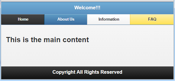
Here you could see that different themes are applied to different buttons (links).
Try this yourself:
<!DOCTYPE html>
<html>
  <head>
   <title>Sample Code</title>
   <link rel="stylesheet" href="http://code.jquery.com/mobile/1.3.2/jquery.mobile-1.3.2.min.css" />
   <script src="http://code.jquery.com/jquery-1.9.1.min.js"></script>
   <script src="http://code.jquery.com/mobile/1.3.2/jquery.mobile-1.3.2.min.js"></script>
  </head>
  <body>
    <div data-role="header">
      <h1>Welcome!!!</h1>
      <div data-role="navbar" class="ui-body-b">
        <ul>
          <li><a href="#">First</a></li>
          <li><a href="#">Second</a></li>
          <li><a href="#">Third</a></li>
          <li><a href="#">Fourth</a></li>
          <li><a href="#">Fifth</a></li>
          <li><a href="#">Sixth</a></li>
         </ul>
      </div>
   </div>
   <div data-role="content">
      <h2>This is the main content</h2>
   </div>
   <div data-role="footer" data-position="fixed">
     <h3>Copyright All Rights Reserved</h3>
   </div>
  </body>
</html>
Save the file as multirows.html and open it using browser. You will get a screen like this:
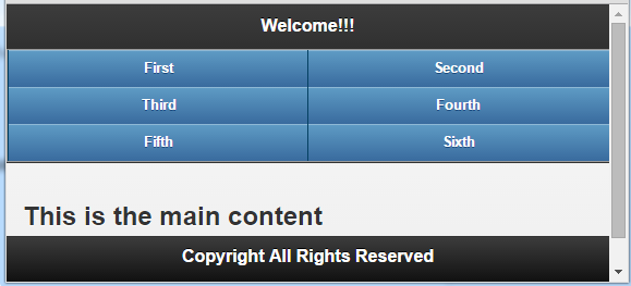
Here you could find that as there are more than five links, they are displayed in multiple rows. We also applied the same theme to all the buttons by adding the class ui-btn-b.
Icons and Positioning
You can also add icons to your buttons using the data-icon attribute. You can position the icons using the attribute data-iconpos and the possible values are top, right, bottom and left. Icons are placed on the top by default.
Try this yourself:
<!DOCTYPE html>
<html>
  <head>
   <title>Sample Code</title>
   <link rel="stylesheet" href="http://code.jquery.com/mobile/1.3.2/jquery.mobile-1.3.2.min.css" />
   <script src="http://code.jquery.com/jquery-1.9.1.min.js"></script>
   <script src="http://code.jquery.com/mobile/1.3.2/jquery.mobile-1.3.2.min.js"></script>
  </head>
  <body>
    <div data-role="header" data-theme="b">
     <h1>Welcome!!!</h1>
    </div>
    <div data-role="content">
      <h2>This is the main content</h2>
    </div>
    <div data-role="footer" data-position="fixed">
       <div data-role="navbar" data-iconpos="right">
        <ul>
          <li><a href="#"  data-theme="a" data-icon="home">Home</a></li>
          <li><a href="#"  data-theme="c" data-icon="info">Information</a></li>
          <li><a href="#"  data-theme="e" data-icon="tag">FAQ</a></li>
          <li><a href="#"  data-theme="b" data-icon="search">Search</a></li>
        </ul>
      </div>
      <h3>Copyright All Rights Reserved</h3>
    </div>
  </body>
</html>
Save the file as icons.html and open it using your browser. You will get a screen like this:
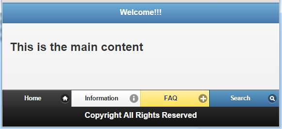
Here we have added the navigation bar with the footer. You could find that all the icons are placed at the right.
Active Links
When a link is clicked, its gets a different look of being selected. If you want to achieve this look without actually clicking the link, then you can add the class ui-btn-active to the required link. If you want to give the selected look for each button that represents the page the user is on, then add the class ui-state-persist along with the ui-btn-active.
Try this yourself:
<!DOCTYPE html>
  <html>
   <head>
    <title>Sample Code</title>
    <link rel="stylesheet" href="http://code.jquery.com/mobile/1.3.2/jquery.mobile-1.3.2.min.css" />
    <script src="http://code.jquery.com/jquery-1.9.1.min.js"></script>
    <script src="http://code.jquery.com/mobile/1.3.2/jquery.mobile-1.3.2.min.js"></script>
   </head>
   <body>
     <!-- Start of welcome page -->
    <div id="welcome" data-role="page">
      <div data-role="header">
        <h1>Welcome to the Yummy World!!!</h1>
        <div data-role="navbar" class="ui-body-c">
           <ul>
             <li><a href="#" class="ui-btn-active ui-state-persist">Home</a></li>
             <li><a href="#first">Cakes</a></li>
           </ul>
       </div>
     </div>
     <div data-role="content">
        <h2>This site is for cake lovers!!!</h2>
     </div>
     <div data-role="footer" data-position="fixed">
        <h3>Copyright All Rights Reserved</h3>
     </div>
    </div>
    <!-- Start of first page -->
    <div id="first" data-role="page">
      <div data-role="header">
        <h1>List of Cakes!!!</h1>
        <div data-role="navbar" class="ui-body-c">
         <ul>
           <li><a href="#welcome">Home</a></li>
            <li><a href="#" class="ui-btn-active ui-state-persist">Cakes</a></li>
         </ul>
        </div>
      </div>
      <div data-role="content">
        <h3>Here is a list of yummy cakes!!!</h3>
        <ul>
          <li>Black Forest Cake</li>
          <li>Chocolate Cake</li>
          <li>White Forest Cake</li>
       </ul>
     </div>
     <div data-role="footer" data-theme="a" data-position="fixed">
       <h3>Copyright All Rights Reserved</h3>
    </div>
   </div>
  </body>
</html>
Save this file as persist.html and open it using your browser. You will get a screen like this
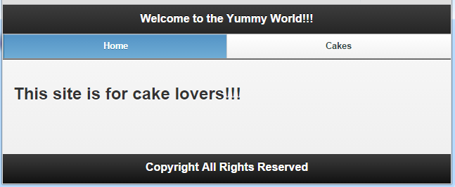
If you click the Cakes link, you will get a screen like this:
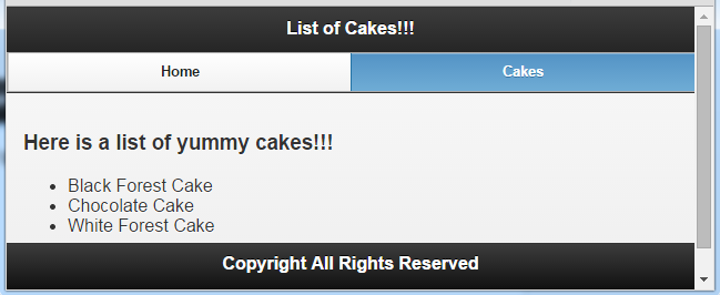
Here you could see that the button that represents the page you are on gets the selected look.
Summary
In this section, we have seen how to add navigation bars at the header or footer as you want. We have also see how we can add icons to the links and position them differently. We have also seen how to give the selected look to the button that represents the page the user is on.
