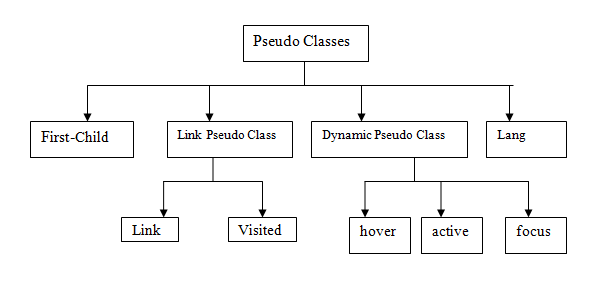
A Pseudo class is a class-like entity in CSS that empowers the web designers to format the elements that lie outside the document tree.
So, now you should ask, what is this document tree?
It is simple. Each element in the code has exactly one parent except the root element. That forms a structure of tree.
Using these pseudo classes we can select elements based upon special criteria. We have seen this before too.
When? Do you remember changing the color of hyperlinks based upon its state like changing the link color to blue when the link is visited or hovered on etc.
This is one way of using pseudo classes and the other way is creating some criterion on which the element gets selected for formatting.
Pseudo classes are used along with selectors.
Syntax
Selector: pseudo-class {
Property: value;
}
We can also use pseudo classes with class names
Selector. class: pseudo-class {
Property: value;
}
Classification of Pseudo classes in CSS

The first-child
The first-child pseudo class of CSS helps us to target an element that is the first child. Remember, it only selects the very first descendant.
An Example,
<html>
   <head>
      <style>
         p:first-child{
         color:Brown;
         background-color:#ABF;}
      </style>
   </head>
   <body>
      <p> I’m the first child, I need to obey the rule!</p>
      <p> I don’t follow any rules.</p>
   </body>
</html>
The desired output is:

The above example selects a paragraph element that is the first child of its parent.
A doctype is mandatory for IE8 and its earlier versions.
Link Pseudo classes
To select links based on their status, we use the link and visited pseudo classes.
The link Pseudo class
This selects the links that have not yet been visited.
The Visited Pseudo class
This selects the links that are visited.
An Example:
<html>
   <head>
      <style>
         a:link {
         color:green;
         text-decoration:none;
         }
         a:visited {
         text-decoration:none;
         color:Brown;
         }
      </style>
   </head>
   <body>
      <a href="https://www.google.co.in/?gws_rd=ssl#q=text+decoration"> This is a link!!!</a>
   </body>
</html>
The desired output when the link is not yet visited:

The desired output after the link has been visited:

These pseudo classes can be used efficiently to distinguish the visited links from unvisited links.
The Dynamic Pseudo Classes
We have three pseudo classes in this category of CSS.
- active
- hover
- focus
These come into the picture as and when an action occurs dynamically.
Active selects a specified element when it becomes active. For instance, a link could be selected when it is clicked.
Hover selects a specified element when the user rolls the mouse over it.
Focus selects a specified element when the element gets focus through some event (keyboard or user input). This pseudo class is used often when dealing with forms in HTML.
An Example,
<html>
   <head>
      <style>
         a:active {
         color: red;
         }
         a:hover {
         text-decoration: none;
         color: blue;
         background-color: yellow;
         }
         input:focus{
         background: pink;
         }
      </style>
   </head>
   <body>
      <form>
         First Name: <input type="text" name="first_name"/>
      </form>
      <a href="www.google.co.in">This is a link!</a>
   </body>
</html>
The output of the above program would be:

When the focus is applied:

When the link is hovered:

To make the most of these dynamic pseudo classes follow this order(remember this is only useful not a mandatory thing)
- Link
- Visited
- Focus
- Hover
- Active
The Lang Pseudo class
This pseudo class matches an element based on the language of an element.
It is mostly used in the cases where multiple languages are used. IE8 and its earlier versions do not extend full support to this pseudo class. Hence, a doctype must be specified.
The above discussed are the most commonly used pseudo classes in CSS. We also have other classes that are not used often. They are,
- :target
- :enabled
- :disabled
- :checked
- :indeterminate
- :root
- :last-child
- :nth-child(n)
- :nth-of-type(n)
- :first-of-type
- :last-of-type
- :nth-last-of-type(n)
- :nth-last-child(n)
- :only-of-type
- :not(p)
- :empty
- :in-range
- :invalid
- :only-child
- :optional
- :out-of-range
- :read-only
- :read-write
- :required
- :valid
We will discuss about the pseudo elements in our next chapter.
